
Crooze — Visual Identity
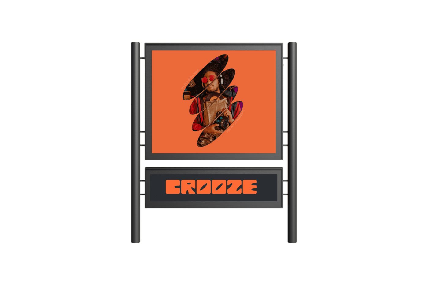
The graphic side of the same Crooze project — a logo, street signage and a set of album-style cover art pieces that give the radio brand a consistent visual voice across print and digital touchpoints.
Overview
Giving Crooze a face outside the app
An app is only part of a brand — Crooze also needed to show up on the street, in the studio and on the covers listeners would see when a new episode dropped. This part of the project was about taking the app's orange-and-black identity and translating it into physical and print touchpoints.
I designed a set of square, album-style cover pieces for Crooze's featured artists, using cropped photography and the "EROOZE" wordmark to keep every cover instantly recognisable, even at thumbnail size. On the environmental side, I designed street signage that could sit outside partner venues and studios, keeping the same type treatment and colour palette as the app.
The result is a small but coherent brand system — the same visual language works whether someone meets Crooze through a phone screen or a physical sign on the street.